
Print File Preparation and Design Tips for Custom Printed Menu Cards | WPE Production
, by WPE Production , 5 min reading time
, by WPE Production , 5 min reading time
Well-prepared files make a big difference when ordering custom printed menu cards from WPE Production. A clean file saves time, avoids reprints, and keeps colors crisp. This guide covers practical menu design tips, bleed and trim for menus, font embedding for print, file specs, and a final preflight checklist.
If you run a restaurant or manage a brand, menus are a key touchpoint. Good design and proper files ensure the menu looks as intended in hand. This how-to is for restaurant owners, graphic designers, and small business teams who need reliable print results.
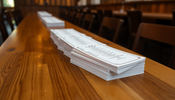
Decide the menu type first. Choose single panel, folded, booklet, or table tent based on use. Single panels are cheap and quick. Folded menus add pages without much cost. Booklets suit large menus with sections. Table tents are great for specials.
Format affects layout and print costs. More panels mean higher paper and finishing costs. Consider how the menu will be handled and how often it changes. For frequent updates, consider a smaller run or laminated options from WPE Production.
Use menu design tips that match your guests. Fast-casual customers prefer short lists and clear prices. Fine dining can handle more descriptive language. Prioritize legibility and quick scanning to boost orders.
Keep language direct, use headings, and break items into clear categories. Large fonts and spacing help older readers and increase order speed.
Place high-margin and signature dishes where eyes go first. Top right and center areas get the most attention. Use columns, boxes, and whitespace to guide focus. A clear visual path improves decision time and average check.
Decide when to use photos or icons. Photos can sell high-ticket items but clutter small menus. Use icons for dietary notes to save space. Text-only layouts often feel cleaner and read faster.
Keep spacing and margins consistent. Align items and prices on a grid. Consistent alignment looks professional and makes scanning easy.
Use CMYK-friendly brand colors. Some bright RGB tones don’t reproduce well in print. Ensure contrast between text and background to keep menu items legible under low light.
Pick paper and finishes that enhance colors. Matte papers reduce glare, while gloss can make images pop. Add spot varnish or a soft-touch laminate for a premium feel from WPE Production.
Bleed is the area that extends past the trim line. Trim is where the cutter will cut the sheet. The safe zone, or live area, keeps important text and logos away from the trim. Understanding bleed and trim for menus prevents accidental cut-offs.
Set bleed at 0.125 inches or 3mm in most design apps. Add safe margins of at least 0.125 to 0.25 inches inside the trim. For folded items, account for the fold when placing text and images.
Use WPE Production templates if available. They include precise trim, bleed, and fold lines for each product, reducing layout errors.
Extend backgrounds and images to the bleed edge. Keep all text and logos inside the safe zone. Add crop marks and bleed when exporting PDFs to show the print house where to trim.
Use legible fonts. Recommended sizes: headings 18 to 36 points, body 10 to 12 points, disclaimers 7 to 8 points. Match font styles to your brand voice and use pairs for hierarchy.
Font embedding for print is essential. Embed or subset fonts when exporting PDFs so WPE Production prints the exact type. Converting text to outlines is an option if font licenses prevent embedding. Outlines lock the appearance but lose editability.
Embedding keeps file size smaller than full font packages and preserves kerning and spacing. When in doubt, export a PDF with embedded fonts and attach source files if edits may be needed.
Check accented letters and special symbols. Some fonts replace characters and break layout. Manually adjust kerning for tight logos or headers to avoid collisions after printing.
Use 300 DPI for photos at final print size. Keep logos as vectors where possible. Preferred files include TIFF, PSD, PNG for images, and EPS or PDF for vector art.
Convert files to CMYK for predictable printing. Soft-proof on screen to check color shifts. Save swatches for critical brand colors and check Pantone matches when necessary.
If color accuracy matters, request a physical proof from WPE Production. A proof shows how colors and paper interact in the real world.
Export high-quality PDF/X-1a or PDF/X-4 when possible. Include bleed and crop marks. Embed fonts, and keep images at 300 DPI. Flatten transparency if using older production pipelines.
Run a quick checklist before sending files. Confirm bleed, safe zones, fonts, color mode, resolution, and spelling. Verify fold lines and margins. This reduces reprints and delays.
Use the store upload portal or your agreed file transfer method. Name files clearly with project, size, and version. Include instructions for folds, varnish, and finishes. Request a digital or physical proof if needed.
Clear notes about paper stock and special finishes prevent surprises and ensure your custom printed menu cards look great off the press.
Good design plus correct file setup gives reliable results. Use the menu design tips above, set proper bleed and trim for menus, and ensure font embedding for print. Check images, color profiles, and run a preflight checklist.
When ready, upload your files to WPE Production and request a proof. Follow these steps to get crisp, accurate, and on-time custom printed menu cards that match your brand and delight customers.
Prepare your files today and contact WPE Production for help with templates or proofs.